Research Methods for Global Studies II (GLO1221)

Teaching material for Quantitative Methods track in Semester 1
Tutorial 4
Tutorial Summary:
- Load data with pandas
- Measurement types
- Basic visualisation
In this tutorial we will use some data visualisation techniques to explore the idea of data measurement levels. To do this we will introduce two Python modules pandas and matplotlib. Start your notebook with a cell that imports these modules. Remember that you only need to run this once per session:
import pandas as pd
import matplotlib.pyplot as plt
You should notice that the code above is a bit different from the code we were using in the last tutorial to import modules. Here we have introduced the keyword as to indicate that we would like to use an alias.
In Python, an alias refers to an alternative name or nickname given to a module. Aliases are handy because they allow you to use a shorter or more convenient name for something that might have a longer or more complex actual name. They make your code more readable and sometimes more concise. Aliases can be handy when you have to type out a module name many times.
To use an alias, we replace the module (or module.submodule) name with the alias.
Exercise 1: Adapt the code below so that it uses the alias plt.
# Data
x = [1, 2, 3, 4, 5]
y = [2, 4, 6, 8, 10]

# Create a simple line plot
matplotlib.pyplot.plot(x, y)
We’ll come back to visualisations later in the tutorial. First let’s load some data using the pandas module.
Pandas
Pandas is a powerful and widely-used data manipulation and analysis module in Python. It’s incredibly useful when you’re working with data. Whether you’re dealing with survey responses, economic indicators, or social demographics, Pandas provides you with the tools to load, explore, clean, and analyse data efficiently.
The pandas module mainly works with structured data. Structured data are data that we represent in a table in which there are rows and columns, where each row represents an individual observation or record, and each column represents a different attribute or variable. In pandas such a “table” is a new data type called a DataFrame.
Each column in a DataFrame has a label or name, which is used to identify and access that specific column. A DataFrame has an index that labels each row. The index can be a sequence of numbers, custom labels, or even dates, and it helps identify and retrieve specific rows. A DataFrame is designed to hold data of the same data type within each column.
Here’s a simple example of what a DataFrame might look like:
   Name    Age   City
0  Alice   25    NYC
1  Bob     30    LA
2  Carol   22    Chicago
3  David   28    Boston
In this DataFrame, each row represents a person with attributes like Name, Age, and City. The column labels (Name, Age, City) are used to identify and access specific attributes.
Read data files with Pandas
The Pandas library makes it easy to load structured data from a file. Computer files come in different formats that tell the computer how to read them. We will use CSV format files. CSV stands for Comma Separated Value. A CSV file is a text file in which values are separated by commas. We usually identify CSV files by the .csv at the end of the filename (although sometimes a different ending is used and will also work, e.g., .txt).
For example the DataFrame above could be saved as a CSV file:
Name, Age, City
Alice, 25, NYC
Bob, 30, LA
Carol, 22, Chicago
David, 28, Boston
- Loading Data from a Local Source (e.g., your computer):
To load a CSV file from your working directory you can use the
read_csv()function:# Load a CSV file from your local computer data = pd.read_csv('your_file.csv')Replace
'your_file.csv'with the actual file path and name. If you installed Anaconda with default settings, then your working directory will likely be:- Windows 10:
C:\Users\<your-username>\Anaconda3\ - macOS:
/Users/<your-username>/anaconda3
So you can use the full path, e.g., on windows:
# Load a CSV file from your local computer
data = pd.read_csv('C:\Users\<your-username>\Anaconda3\your_file.csv')
You can then change the path to somewhere else on your computer, e.g.,
C:\Downloads\your_file.csv. - Windows 10:
-
Loading Data from a Remote Source (e.g., the internet): To load data from a remote source, you can use the same function, just change the file path and name with the URL:
# Load data from a remote CSV file
url = 'https://example.com/your_data.csv'
data = pd.read_csv(url)
Replace
'https://example.com/your_data.csv'with the actual URL of the data you want to load.
In both cases above we have read the CSV file and stored it as a Pandas DataFrame in a variable called data. Don’t forget that you can name the variable (almost) anything you like and it’s best if you name it something meaningful, e.g., population_dataframe.
Note that if you provide the wrong location for the file or wrong file name then you will get an error.
url = 'aFileThatDoesNotExist.csv'
df = pd.read_csv(url)
---------------------------------------------------------------
FileNotFoundError                         Traceback (most recent call last)
<ipython-input-11-5b3ae3a38afe> in <module>
      1 url = 'aFileThatDoesNotExist.csv'
----> 2 df = pd.read_csv(url)
Note that as far as python is concerned, a typo is the same as the wrong location or file name!
Exercise 2: Why does the error message indicate that there is a problem with the second line of code and not the first?
Exercise 3: Read the data from the introduction survey into a variable gs_intro_survey.
url = 'https://docs.google.com/spreadsheets/d/e/2PACX-1vTEX2jqDTG_1uLK6lc1jxhsLQd47DSpVDOQH4MOqk0LJXoDXxWvc68ozzUafm_LlDPUqwV6CHEc8AvO/pub?gid=392676485&single=true&output=csv'
Exercise 4: Open a text editor, either on your computer or one online and create your own CSV file that describes your family. On the first line write the name of the columns that describe the attributes of each person, e.g., Name, Age, Favourite Colour, Occupation. Include one row for each person in your family. Feel free to choose which attributes to include and/or make up values if you don’t want to include real ones.
Save/Download the file and try to load it using Pandas.
View the data in pandas
You can use the head() function of a dataframe to display the first few lines of the dataframe and the columns property to see a list of columns.
Exercise 5: Use gs_intro_survey.head(5) to view the first five entries of the survey. Then change the code to display the first 10 entries.
Exercise 6: What is different about this function compared to previous functions we have encountered?
Exercise 7: Use gs_intro_survey.columns to display the questions of the survey. Why do we not include brackets () after .columns?
 |
 |
|
|---|---|---|
| Use pandas to read and analyse data1 |
Measurement levels
In the lecture we discussed the four measurement levels in quantitative data analysis. The table below provides a summary:
| Measurement Level | Description | Examples | Arithmetic Operations |
|---|---|---|---|
| Nominal Scale | Categories or labels with no inherent order or ranking. | Gender (Male, Female), Colors (Red, Blue), Types of Animals (Dog, Cat) | Counting, Frequency Distribution |
| Ordinal Scale | Values with meaningful order or ranking, but unequal intervals. | Educational Levels (High School, College, Graduate), Satisfaction Ratings | Ranking, Comparing Relative Positions |
| Interval Scale | Values with meaningful order, equal intervals, but an arbitrary zero point. | Temperature (Celsius, Fahrenheit) | Addition, Subtraction, Means, Standard Deviation |
| Ratio Scale | Values with meaningful order, equal intervals, and a true zero point (absence of attribute). | Height, Weight, Age, Income, Time | All Basic Arithmetic Operations |
This table provides a clear overview of each measurement level’s characteristics, examples, and the types of arithmetic operations applicable to them.
Exercise 8: State which measurement levels corresponds to each of the columns in gs_intro_survey and justify your answer. Use the print() function and index the columns (e.g., columns[1]) as a variable in an F-string to display your answer, e.g., you should create an output like:
The responses to How tall are you (in metres)? are ratio scale because... `.
Basic plotting with Matplotlib and Pandas
Matplotlib is a widely used Python module for data visualisation. It’s a versatile tool that enables you to create a wide range of charts and graphs to represent data in a visually meaningful way. Matplotlib allows you to generate various types of plots, such as line charts, bar graphs, scatter plots, and more, so that you can visually explore patterns, trends, and relationships within your data.
In the following examples we will implement a few single variable plots using Pandas and Matplotlib.
Bar charts
# Sample DataFrame with a nominal column
data = {'Category': ['A', 'B', 'A', 'C', 'B', 'A', 'A', 'C', 'B', 'C']}
my_dataframe = pd.DataFrame(data)

# Count the occurrences of each category in the 'Category' column
category_counts = my_dataframe['Category'].value_counts()

# Create a bar chart
category_counts.plot(kind='bar')

# Adding labels and title
plt.xlabel('Categories')
plt.ylabel('Count')
plt.title('Count of Categories')
- We create a simple DataFrame
my_dataframewith a single column ‘Category’. - We use the
value_counts()function to count the occurrences of each unique value (‘A’, ‘B’ or ‘C’) in the ‘Category’ column. This method creates a Pandas Series with the counts. - We create a bar chart using the
plot(kind='bar')function on the variablecategory_counts. This generates a simple bar chart with category labels on the x-axis and counts on the y-axis. - We add labels to the x-axis and y-axis using
plt.xlabel()andplt.ylabel(). - We set the title of the chart using
plt.title().
 |
|---|
| A simple bar chart |
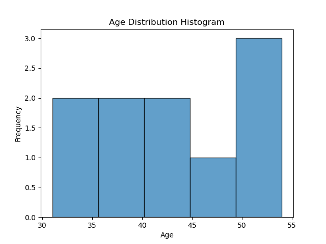
Histograms
# Sample DataFrame with a numerical column
data = {'Age': [51, 54, 38, 34, 46, 36, 31, 44, 42, 54]}
ages_df = pd.DataFrame(data)

# Create a histogram
ages_df['Age'].plot(kind='hist', bins=5, edgecolor='black', alpha=0.7)

# Adding labels and title
plt.xlabel('Age')
plt.ylabel('Frequency')
plt.title('Age Distribution Histogram')
- We create a simple DataFrame
ages_dfwith a single column ‘Age’. - We create a histogram using the
plot(kind='bar')function on the ‘Age’ column. Thebinsparameter specifies the number of bins or intervals in the histogram,edgecolorsets the colour of the bin edges, andalphacontrols the transparency of the bars. - We add labels to the x-axis and y-axis using
plt.xlabel()andplt.ylabel(). - We set the title of the chart using
plt.title().
 |
|---|
| A simple histogram |
Exercise 9: What is the difference between a bar chart and a histogram?
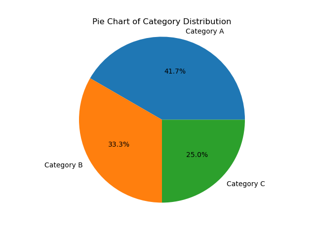
Pie charts
# Sample DataFrame with a nominal column
data = {'Category': ['A', 'B', 'A', 'C', 'B', 'A', 'A', 'C', 'B', 'C', 'A', 'B']}
categories_df = pd.DataFrame(data)

# Count the occurrences of each category in the 'Category' column
category_counts = categories_df['Category'].value_counts()

# Create a pie chart
category_counts.plot(kind='pie', autopct='%1.1f%%')

# Adding a title
plt.title('Pie Chart of Category Distribution')
# Remove the x and y-label
plt.xlabel('')
plt.ylabel('')
# Display the chart
plt.axis('equal')  # Equal aspect ratio ensures that the pie chart is circular.
- We create a simple DataFrame
categories_dfwith a single column ‘Category’. - We use the
value_counts()function to count the occurrences of each unique value (‘A’, ‘B’ or ‘C’) in the ‘Category’ column. This method creates a Pandas Series with the counts. - We create a pie chart using the
plot(kind='pie')function on the variablecategory_countsand label each category withdf['Category']. Theautopctparameter adds percentage labels. - We set the title of the chart using
plt.title(). - We set
plt.axis('equal')to ensure that the pie chart appears circular.
 |
|---|
| A simple pie chart |
Exercise 10: State which measurement levels can be used with each plot type (Bar chart, Histogram, Pie chart) and explain why.
Exercise 11: Use a suitable plot to visualise each column of gs_intro_survey. You can skip the Timestamp and What sort of job…? columns. Make sure to use appropriate titles and labels for each plot.
|
 |
|
|---|---|---|
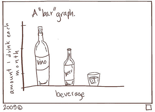
| A “bar” graph2 |
|
 |
|
|---|---|---|
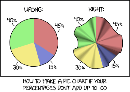
| Pie charts should not be greater than the sum of their parts3 |
-
AI generated image using Canva. ↩
-
Bar graph by Courtney Gibbons licensed under CC BY-NC-SA 3.0 ↩
-
Pie charts by xkcd licensed under CC BY-NC 2.5 ↩