Research Methods for Global Studies II (GLO1221)

Teaching material for Quantitative Methods track in Semester 1
Tutorial 7
Tutorial Summary:
- Recap of variance
- Visualising relationships
- Covariance and correlation
In this tutorial we will investigate how to describe the relationship between two variables. Last week we considered different ways to describe how a single variable varies, such as the variance. We will start this week with a recap of variance.
Variance
Variance is like a measure of how spread out or scattered your data points are. Imagine you have a set of exam scores. If the variance is high, it means the scores are all over the place. If the variance is low, the scores are close to each other.
Example: Exam Scores
- High Variance: {50, 20, 80, 100, 10}
- Low Variance: {85, 88, 87, 89, 86}
We can load a pandas DataFrame with these values:
df_scores = pd.read_csv('https://piratepeel.github.io/GlobalStudiesQuantMethodsS1/data/example_scores.csv')
and plot a rug plot to see visualise the scores:
high_var = df_scores['high_var']

# Create subplots
fig, axes = plt.subplots(nrows=1, ncols=1, figsize=(8, 4))

# Plot rug plot
axes.plot(high_var, np.zeros_like(high_var), '|', color='green', markersize=15)
axes.axvline(np.mean(high_var), color='black', linestyle=':')
axes.set_yticks([])  # Hide y-axis markers and numbers
axes.set_title('Rug Plot')
axes.set_ylim(-1.25, 4.5)
axes.set_xlim(-5, 105)
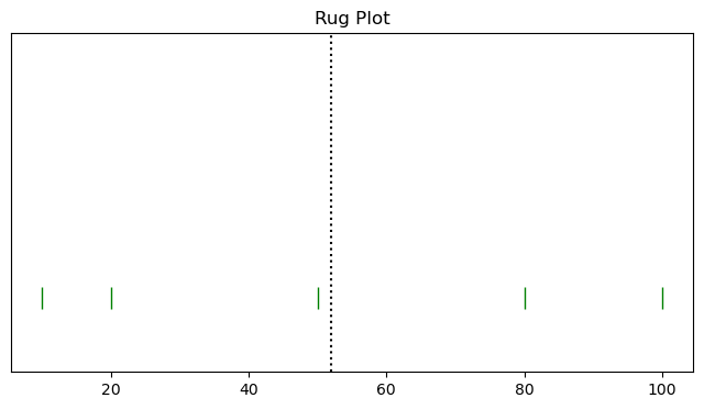
The black dotted line indicates the mean and the green bars are the individual scores.
# Create subplots
fig, axes = plt.subplots(nrows=1, ncols=1, figsize=(8, 4))

# Plot rug plot
axes.plot(high_var, np.zeros_like(high_var)-1, '|', color='red', markersize=15)
axes.axvline(np.mean(high_var), color='black', linestyle=':')
axes.set_yticks([])  # Hide y-axis markers and numbers
axes.set_title('Rug Plot with Distances to Mean')
axes.set_ylim(-1.25, 4.5)
axes.set_xlim(-5, 105)

# Show the distance from the mean for each point
mean_high_var = np.mean(high_var)
for i in range(len(high_var)):
    score = high_var[i]
    distance = (score - mean_high_var)
    axes.text(score, i + 0.1, f'{distance:.2f}', color='blue', ha='center', va='bottom', fontsize=8)

    # Lines connecting each point to the mean
    axes.plot([score, mean_high_var], [i, i], color='blue', linestyle='--', linewidth=0.8)
    axes.plot([score, score], [-1, i], color='red', linestyle='-.', linewidth=0.8)
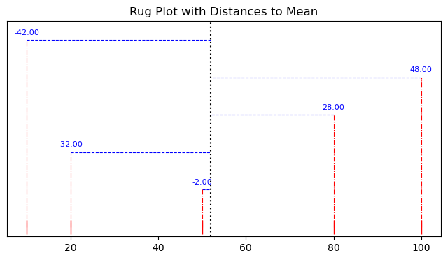
Exercise 1: Complete the calculation of variance by squaring (i.e., multiply each value by itself) the distances and calculating the mean. Confirm your answer using the numpy.var() function.
Exercise 2: Repeat the above with the low variance scores df_scores['high_var']. Does the change in variance between the two sets of scores match what you expect from the definition of variance?
Visualising the relationship between two variables
A good first step in identifying a relationship between two variables is to visualise the data. Let’s imagine we are interested in trying to identify if there is a relationship between the outside temperature and sales of ice cream.
We can load the data:
# load the data
url = 'https://piratepeel.github.io/GlobalStudiesQuantMethodsS1/data/ice_cream.csv'
df_ice_cream = pd.read_csv(url, parse_dates=['Date'])
and then we can simply plot the two values, temperature and ice cream sales as a function of time:
# Create subplots
fig, axes = plt.subplots(nrows=1, ncols=1, figsize=(10, 5))

# Plot the time series on the same axes
axes.plot(df_ice_cream['Date'], df_ice_cream['Temperature'], label='Temperature', marker='o', linestyle='-', color='blue')
axes.plot(df_ice_cream['Date'], df_ice_cream['IceCreamSales'], label='Ice Cream Sales', marker='s', linestyle='-', color='orange')

# Set labels and title
axes.set_title('Time Series of Temperature and Ice Cream Sales')
axes.set_xlabel('Date')
axes.set_ylabel('Values')

# Add a legend
plt.legend()
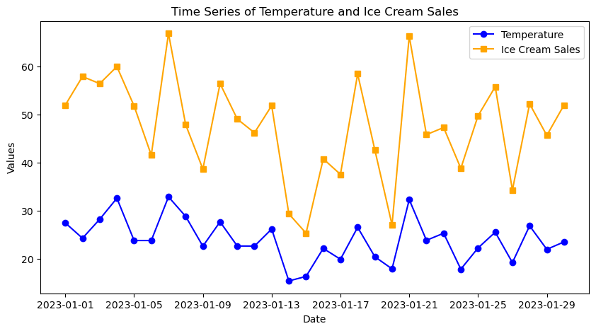
Looking at the above plot we can perhaps make out a bit of a pattern: as the temperature increases, we often see higher numbers of ice cream sales. However, if we are interested in examining the relationship between two variables it can be clearer to use a scatter plot. Matplotlib has a plt.scatter() function for plotting scatter plots:
# Create subplots
fig, axes = plt.subplots(nrows=1, ncols=1, figsize=(10, 5))

# Plot the data
axes.scatter(df_ice_cream['Temperature'], df_ice_cream['IceCreamSales'], color='black', label='Data points')
axes.set_title('Correlation Between Temperature and Ice Cream Sales')
axes.set_xlabel('Temperature (°C)', color='blue')
axes.set_ylabel('Ice Cream Sales', color='orange')
axes.axvline(np.mean(df_ice_cream['Temperature']), color='blue', linestyle=':')
axes.axhline(np.mean(df_ice_cream['IceCreamSales']), color='orange', linestyle=':')
plt.legend()
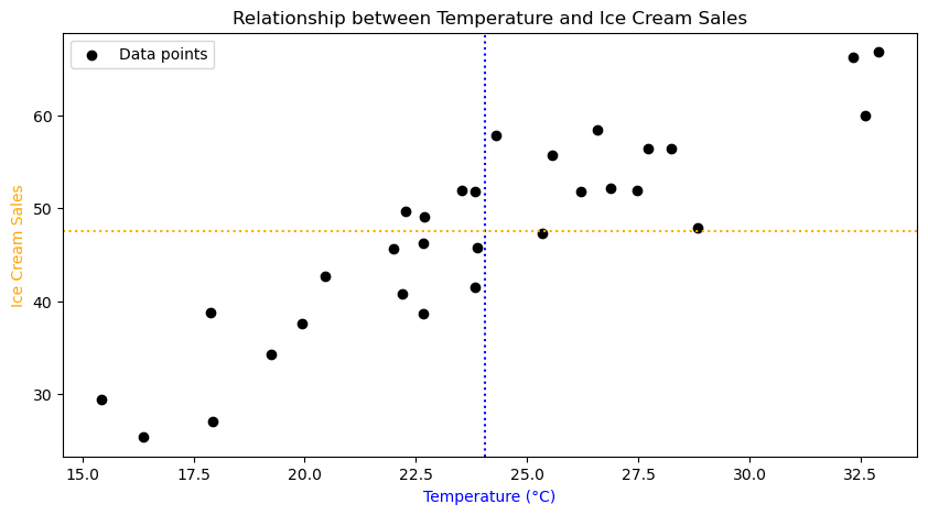
The dotted lines indicate the mean values.
Exercise 3: Describe the pattern that you see in the scatter plot. What does this tell you about the relationship between ice cream sales and the temperature?
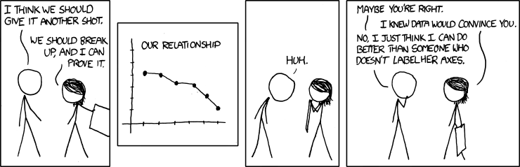 |
|---|
| Don’t forget to label your axes.1 |
Covariance
Covariance is a measure of how two sets of data change together. If they tend to increase or decrease at the same time, the covariance is positive. If one goes up when the other goes down, it’s negative.
Example: Hours studied and Exam scores.
- Positive Covariance: More study hours, higher scores.
- Negative Covariance: More classes missed, lower scores.
The covariance is related to the variance. Look at the formulas for comparison:
\[\textrm{Variance}(x) = \frac{\sum_{i=1}^n (x_i−m_x)(x_i-m_x)}{n},\] \[\textrm{Covariance}(x,y)= \frac{\sum_{i=1}^n (x_i−m_x)(y_i-m_y)}{n},\]Exercise 4: What do all the symbols mean in the formulas above? Can you see the difference between the variance and covariance from the formulas?
Exercise 5: The animation demonstrates something from the calculation of covariance. Looking at the formulas and the animation, what does this tell you about covariance?
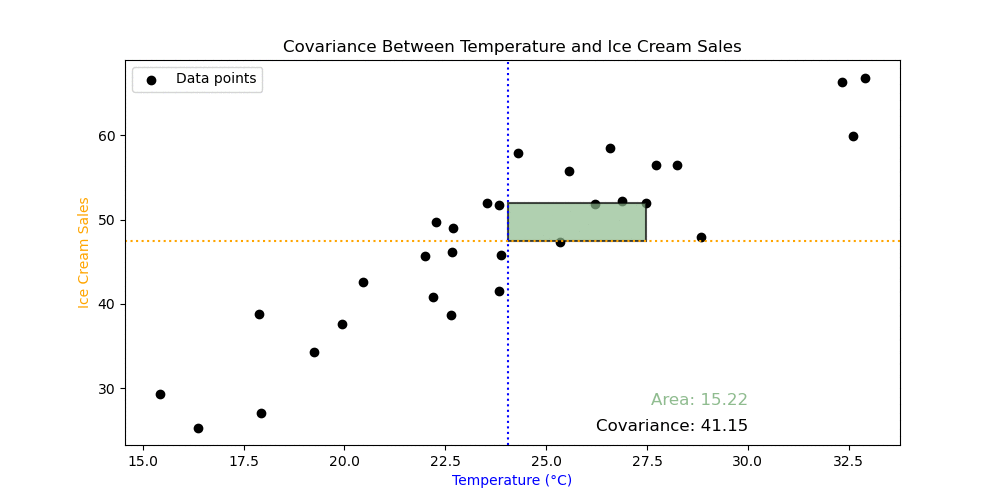
Exercise 6: Calculate the covariance using the numpy.cov() function. What does the output mean? Use the numpy.var() to try to understand the output of numpy.cov().
Important: you must set the argument ddof=0 in the numpy.var() and numpy.cov() functions to get the correct answer. The meaning of this is not relevant for this course, but will be discussed next semester as part of inferential statistics.
Correlation
Correlation is like a standardised version of covariance. It gives a value between -1 and 1. A value close to 1 means a strong positive relationship, close to -1 means a strong negative relationship, and close to 0 means no clear relationship.
Exercise 7: Calculate the correlation using np.corrcoef() between ice cream and temperature. If you can, then display the correlation in the figure using plt.text().
Phi Coefficient
The phi coefficient, often denoted as $\phi$ (phi), is a statistical measure used to assess the degree of association or correlation between two categorical variables. It is particularly applicable when both variables have two categories (binary variables).
-
Binary Variables: The phi coefficient is suitable for situations where both variables being analysed have only two categories or states. For example, it could be used to examine the association between gender (male/female) and whether a person owns a car (yes/no).
-
Contingency Table: To calculate the phi coefficient, a contingency table is often created to summarise the frequencies of the joint occurrences of the two categorical variables.
Variable B = 0 Variable B = 1 Variable A = 0 a b Variable A = 1 c d Here,
a,b,c, anddrepresent the frequencies of occurrences based on the combinations of the two categorical variables. -
Formula: The phi coefficient is calculated using the formula:
\[\phi = \frac{ad - bc}{\sqrt{(a + b)(c + d)(a + c)(b + d)}}\]Here, (a), (b), (c), and (d) are the frequencies from the contingency table.
-
Interpretation: The phi coefficient ranges from -1 to 1. A value of 1 indicates a perfect positive association (both variables tend to occur together), -1 indicates a perfect negative association (one variable tends to occur when the other does not), and 0 indicates no association.
In summary, the phi coefficient is a valuable tool for measuring the association between two binary categorical variables, providing insights into the strength and direction of their relationship.
Exercise 8: Use the pandas.crosstab() function, as shown below, to create a contingency table to see if there is an association between previous python experience and student enthusiasm for quantitative methods. Does the contingency table indicate any sort of association?
pd.crosstab(gs_intro_survey['Python_experience']>1, gs_intro_survey['Enthusiastic'])
Using a contingency table, you can calculate the phi coefficient using this function:
def phi(contingency_table):

    # Calculate the phi coefficient
    a = contingency_table.iloc[0, 0]
    b = contingency_table.iloc[0, 1]
    c = contingency_table.iloc[1, 0]
    d = contingency_table.iloc[1, 1]

    phi_coefficient = (a * d - b * c) / np.sqrt((a + b) * (c + d) * (a + c) * (b + d))
    return phi_coefficient
Exercise 9: Use the phi() function above to calculate the phi coefficient. Does the value indicate the existence of an association?
Exercise 10: You can make a binary variable from any other variable by using a conditional statement, e.g., gs_intro_survey['Height']>170. Experiment with creating your own binary variables using the data set and calculate the phi coefficient. Do you find any positive or negative associations?
Correlation $\neq$ Causation
Just because two variables are correlated (i.e., there is a statistical association between them), it doesn’t necessarily mean that one variable causes the other.
Some reasons why correlation does not imply causation:
- Coincidence: The correlation between two variables may be coincidental. There might be no direct relationship between them, and the observed correlation could be due to chance.
- Confounding Variables: A third variable, not considered in the analysis, may be influencing both correlated variables. This is known as a confounding variable, and it can create a spurious correlation.
- Reverse Causation: The direction of causation might be the opposite of what is assumed. Correlation does not provide information about the temporal sequence of events.
For example, consider the correlation between ice cream sales and the number of drowning incidents. Both variables may show a positive correlation because they tend to increase during the summer. However, it would be incorrect to conclude that buying more ice cream causes an increase in drowning incidents or vice versa. The common factor is the season (summer), and there is no direct causal link between the two.
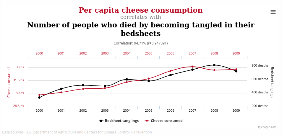
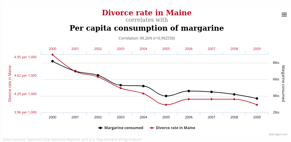
Below are a couple of example of spurious correlations:
 |
|---|
| Cheese consumption and death by bed sheets.2 |
 |
|---|
| Divorces in Maine, USA and margarine consumption.3 |
Why can we find these correlations in seemingly unrelated variables? Simply, these correlations can happen by chance, especially when there are few data points in the dataset.
For example, the following code will generate random data and compare it with the first 10 heights in our dataset.
# select the first 10 heights in the dataset
heights = gs_intro_survey['Height'][:10]

random_generations = 0
correlation = 0
target_correlation = 0.75

while correlation < target_correlation:
    # generate some random data
    random_data = np.random.randn(*heights.shape)
    # check the correlation with the heights
    correlation = np.corrcoef(random_data, heights)[0, 1]
    # increase the count of generations
    random_generations += 1


# Plot the result
fig, axes = plt.subplots(nrows=1, ncols=1, figsize=(8, 4))
axes.scatter(heights, random_data, alpha=0.5)
axes.set_ylabel('Random data values')
axes.set_xlabel('Heights')
axes.set_title(f'After generating {random_generations} datasets we have a correlation = {correlation}')
Exercise 11: Run the above code a few times to see how many random generations are required to achieve a correlation greater than 0.75. Now try doubling the number of heights, i.e., select the first 20 heights from the dataset. What do you notice about the number of generations required to reach the same threshold of correlation?
In summary, while correlation is a valuable tool for identifying associations and patterns in data, it does not provide evidence of a cause-and-effect relationship. Causation requires a more in-depth analysis and often additional experimental evidence.
Exercise 12: Look over the code for the producing the figures in this tutorial. Which parts of the code do you understand and which parts are not clear? Will you be able to reproduce these figures using your own data to perform your own analysis?
 |
|---|
| I know correlation is not causation, but I still won’t eat cheese before bed.4 |
-
Convincing by xkcd licensed under CC BY-NC 2.5 ↩
-
chart by tyler vigen licensed under CC BY 4.0 Deed ↩
-
chart by tyler vigen licensed under CC BY 4.0 Deed ↩
-
Correlation by xkcd licensed under CC BY-NC 2.5 ↩