Research Methods for Global Studies II (GLO1221)

Teaching material for Quantitative Methods track in Semester 1
Install your python environment
Tutorial 1
Tutorial 2
Tutorial 3
Tutorial 4
Tutorial 5
Tutorial 6
Tutorial 3
Tutorial Summary
Core topics:
- Measurement levels
- Basic visualisation
- Measures of location
Advanced topics:
- Introducing Python documentation
In this tutorial we will use some data visualisation techniques to explore the idea of data measurement levels. To do this we will use two Python modules pandas and matplotlib. Start your notebook with a cell that imports these modules. Remember that you only need to run this once per session:
import pandas as pd
import matplotlib.pyplot as plt
Measurement levels
In the lecture we discussed the four measurement levels in quantitative data analysis. The table below provides a summary:
| Measurement Level | Description | Examples | Arithmetic Operations |
|---|---|---|---|
| Nominal Scale | Categories or labels with no inherent order or ranking. | Gender (Male, Female), Colors (Red, Blue), Types of Animals (Dog, Cat) | Counting, Frequency Distribution |
| Ordinal Scale | Values with meaningful order or ranking, but unequal intervals. | Educational Levels (High School, College, Graduate), Satisfaction Ratings | Ranking, Comparing Relative Positions |
| Interval Scale | Values with meaningful order, equal intervals, but an arbitrary zero point. | Temperature (Celsius, Fahrenheit) | Addition, Subtraction, Means, Standard Deviation |
| Ratio Scale | Values with meaningful order, equal intervals, and a true zero point (absence of attribute). | Height, Weight, Age, Income, Time | All Basic Arithmetic Operations |
This table provides a clear overview of each measurement level’s characteristics, examples, and the types of arithmetic operations applicable to them.
Exercise 1: Use pandas to read the data from the introduction survey into a variable gs_intro_survey.
Exercise 2: State which measurement levels corresponds to each of the columns in gs_intro_survey and justify your answer. Use the print() function and index the columns (e.g., columns[1]) as a variable in an F-string to display your answer, e.g., you should create an output like:
The responses to How tall are you (in metres)? are ratio scale because... `.
Basic plotting with Matplotlib and Pandas
Matplotlib is a widely used Python module for data visualisation. It’s a versatile tool that enables you to create a wide range of charts and graphs to represent data in a visually meaningful way. Matplotlib allows you to generate various types of plots, such as line charts, bar graphs, scatter plots, and more, so that you can visually explore patterns, trends, and relationships within your data.
In the following examples we will implement a few single variable plots using Pandas and Matplotlib.
Bar charts
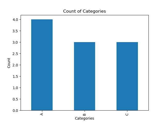
# Sample DataFrame with a nominal column
data = {'Category': ['A', 'B', 'A', 'C', 'B', 'A', 'A', 'C', 'B', 'C']}
my_dataframe = pd.DataFrame(data)

# Count the occurrences of each category in the 'Category' column
category_counts = my_dataframe['Category'].value_counts()

# Create a bar chart
category_counts.plot(kind='bar')

# Adding labels and title
plt.xlabel('Categories')
plt.ylabel('Count')
plt.title('Count of Categories')
- We create a simple DataFrame
my_dataframewith a single column ‘Category’. - We use the
value_counts()function to count the occurrences of each unique value (‘A’, ‘B’ or ‘C’) in the ‘Category’ column. This method creates a Pandas Series with the counts. - We create a bar chart using the
plot(kind='bar')function on the variablecategory_counts. This generates a simple bar chart with category labels on the x-axis and counts on the y-axis. - We add labels to the x-axis and y-axis using
plt.xlabel()andplt.ylabel(). - We set the title of the chart using
plt.title().
 |
|---|
| A simple bar chart |
Histograms
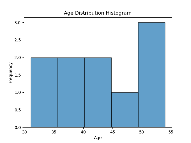
# Sample DataFrame with a numerical column
data = {'Age': [51, 54, 38, 34, 46, 36, 31, 44, 42, 54]}
ages_df = pd.DataFrame(data)

# Create a histogram
ages_df['Age'].plot(kind='hist', bins=5, edgecolor='black', alpha=0.7)

# Adding labels and title
plt.xlabel('Age')
plt.ylabel('Frequency')
plt.title('Age Distribution Histogram')
- We create a simple DataFrame
ages_dfwith a single column ‘Age’. - We create a histogram using the
plot(kind='bar')function on the ‘Age’ column. Thebinsparameter specifies the number of bins or intervals in the histogram,edgecolorsets the colour of the bin edges, andalphacontrols the transparency of the bars. - We add labels to the x-axis and y-axis using
plt.xlabel()andplt.ylabel(). - We set the title of the chart using
plt.title().
 |
|---|
| A simple histogram |
Exercise 3: What is the difference between a bar chart and a histogram?
Pie charts
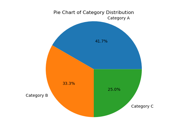
# Sample DataFrame with a nominal column
data = {'Category': ['A', 'B', 'A', 'C', 'B', 'A', 'A', 'C', 'B', 'C', 'A', 'B']}
categories_df = pd.DataFrame(data)

# Count the occurrences of each category in the 'Category' column
category_counts = categories_df['Category'].value_counts()

# Create a pie chart
category_counts.plot(kind='pie', autopct='%1.1f%%')

# Adding a title
plt.title('Pie Chart of Category Distribution')
# Remove the x and y-label
plt.xlabel('')
plt.ylabel('')
# Display the chart
plt.axis('equal')  # Equal aspect ratio ensures that the pie chart is circular.
- We create a simple DataFrame
categories_dfwith a single column ‘Category’. - We use the
value_counts()function to count the occurrences of each unique value (‘A’, ‘B’ or ‘C’) in the ‘Category’ column. This method creates a Pandas Series with the counts. - We create a pie chart using the
plot(kind='pie')function on the variablecategory_countsand label each category withdf['Category']. Theautopctparameter adds percentage labels. - We set the title of the chart using
plt.title(). - We set
plt.axis('equal')to ensure that the pie chart appears circular.
 |
|---|
| A simple pie chart |
Exercise 4: State which measurement levels can be used with each plot type (Bar chart, Histogram, Pie chart) and explain why.
Exercise 5: Use a suitable plot to visualise each column of gs_intro_survey. You can skip the Timestamp and What sort of job…? columns. Make sure to use appropriate titles and labels for each plot.
 |
 |
 |
|---|---|---|
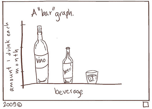
| A “bar” graph1 |
 |
 |
 |
|---|---|---|
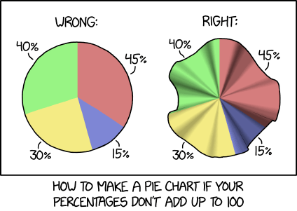
| Pie charts should not be greater than the sum of their parts2 |
Measures of location
Averages tell us something about typical or usual values.
Mean: The mean, commonly known as the average, is a way to find the typical value in a set of numbers. To calculate it, you add up all the numbers and then divide by the total count of numbers. Essentially, the mean represents a balance point within the data, where the sum of all values is evenly distributed.
Mode: The mode is the value that appears most frequently in a dataset. It identifies the item or number that occurs with the highest frequency. The mode helps pinpoint the most common or popular element within the data, making it useful for finding the dominant choice or characteristic in a set of observations. It’s a straightforward way to understand what’s most typical in the data.
Median: The median represents the middle value when a set of numbers is sorted in ascending or descending order. If there’s an even number of values, the median is the average of the two middle values. It offers insight into the middle point of the data distribution, where half of the values are greater and half are lesser. Unlike the mean, the median isn’t influenced by extreme values, making it a robust measure for finding the central position or typical value in a dataset.
Read the data from the introduction survey into a variable gs_intro_survey as you did in Tutorial 2.
url = 'url = 'https://docs.google.com/spreadsheets/d/e/2PACX-1vTEX2jqDTG_1uLK6lc1jxhsLQd47DSpVDOQH4MOqk0LJXoDXxWvc68ozzUafm_LlDPUqwV6CHEc8AvO/pub?gid=267912267&single=true&output=csv''
Exercise 6: Select the column heights and assign the values to a variable, e.g., heights = gs_intro_survey['Height'] and calculate the sum of the heights and count the number of responses.
Hint: you can do choose to do this exercise in a number of ways: (i) using python functions, (ii) with a for loop, or (iii) calculate these values manually yourself.
Exercise 7: Describe how to calculate the mean in your own words. Use your answer from Exercise 6 to calculate the mean height.
Exercise 8: What is the mode? Write some Python code to determine the mode of students’ previous Python_experience and their Enthusiasm. What does this tell you about your cohort?
Introducing python documentation (ADVANCED)
A very useful Python module for statistics is called numpy. All popular Python modules have some documentation to tell you how to correctly use the functions in the module.
Exercise 9: Take a look at the Numpy documentation for calculating descriptive statistics. Can you identify the function for calculating the mean?
Python documentation can seem very technical and overwhelming. But don’t panic, with some practice you will be able to make some sense of it.
Exercise 10: Look at the Numpy documentation that describes the np.mean() function. There is a lot there that will probably not make sense. Try to focus on what, if anything, looks familiar. Is there anything you can understand? Make a note in your notebooks.
Exercise 11: Try to use the np.mean() function to calculate the mean and check your answer to Exercise 9. If you get stuck, then ask chatGPT for help in understanding how to use the function (remember to include the prompt, response and your interpretation if using chatGPT).
Exercise 12: Look at the np.percentile() function. Try to work out how you can use it to calculate the median income.
Exercise 13: If you wanted to fairly distribute income, then which measure of central location might be useful? Try it out and show your answer.
 |
 |
 |
|---|---|---|
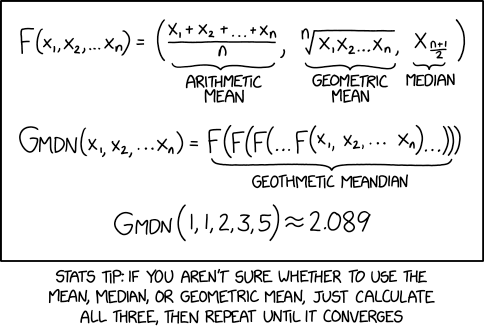
| Different averages, including some less well known ones that we almost certainly will not cover in this course.1 |
-
Bar graph by Courtney Gibbons licensed under CC BY-NC-SA 3.0 ↩ ↩2
-
Pie charts by xkcd licensed under CC BY-NC 2.5 ↩