Networks and Simulation (EBC2184)
Teaching material for Networks and Simulation
Tutorial 2 Notes
Tutorial 2 Exercises
Tutorial 3 Notes
Tutorial 3 Exercises
Tutorial 4 Notes
Tutorial 4 Exercises
Tutorial 5 Notes
Tutorial 5 Exercises
Tutorial 6 Notes
Tutorial 6 Exercises
Tutorial 7 Notes
Tutorial 7 Exercises
Tutorial 8 Notes
Tutorial 8 Exercises
Tutorial Five — Exercises
Visualisation
1. A network layout is not a neutral rendering choice: different algorithms make different structural properties visible, while hiding others. This exercise builds intuition for matching layout choices to the question you are asking.
Take the Florentine families network (the Medici network from Tutorial 3, Exercise 5). Describe or sketch the network under at least three different layout algorithms — for example, force-directed (spring), circular, and spectral (using the two smallest non-zero eigenvectors of the graph Laplacian as x/y coordinates). If you have difficulty computing a layout, describe what you would expect each algorithm to produce based on how it works.
(a) For each layout, identify one structural feature that becomes easier to see and one that becomes harder. Consider: where does the Medici family appear in each layout? Where do peripheral families appear?
(b) The spring/force-directed layout minimises a physical energy function, treating edges as attractive springs and non-edges as repulsive forces. What is the implicit claim this layout makes about node proximity? Under what conditions would it fail to produce an interpretable result — that is, when would proximity not reflect structural similarity?
(Optional) (c) Compute the spectral layout for the Medici network as described above. Compare it to the force-directed layout. Under what conditions do the two layouts agree, and when do they diverge? What does each algorithm treat as the primary structure to reveal?
2. Node position alone carries limited information. Effective visualisation maps additional data — such as centrality scores or community membership — onto visual channels like size, colour, shape, and edge weight. This exercise asks you to design (and, if possible, implement) such encodings for the OpenFlights network, using results you already computed in Tutorials 3 and 4.
You are not required to produce a polished implementation. A sketch, a description of your design choices, or a rough draft plot accompanied by a written explanation of what you intended to show will receive full credit.
(a) Design a visualisation of the OpenFlights airport network (largest connected component) that encodes betweenness centrality as node size and SBM community assignment as node colour. Before or instead of implementing it: describe what you expect the visually prominent nodes (large and distinctly coloured) to look like. Do you expect these to correspond to the airports identified as structurally important in Tutorials 3 and 4? Where would you expect high-betweenness airports to sit relative to community boundaries?
(b) The OpenFlights dataset includes latitude and longitude for each airport. Describe what a geographically positioned layout — using lat/lon as node coordinates rather than a computed layout — would look like compared to a force-directed layout. What structure would become immediately visible? What network structure would be hidden? Would the SBM communities from Tutorial 4 correspond to geographic regions?
(c) Discussion question. You have now considered two ways to position nodes — by network structure (force-directed) and by real-world geography (lat/lon). Both are valid. What criteria would you use to choose between them? Is there a version of this question where one choice is clearly wrong?
(Optional) (d) Consider encoding edge attributes in addition to node attributes — for example, colouring edges by whether the two endpoints belong to the same community, or scaling edge width by route distance. Describe what this encoding would add to the visualisation and what practical difficulties it would create. When does adding edge-level encoding help rather than hurt?
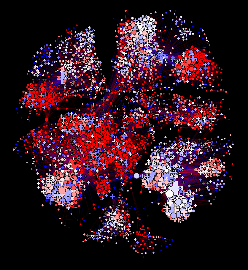
3. Standard visualisation techniques — force-directed layout, node-link diagrams, edge colouring — were developed for small to medium networks. At scale, different trade-offs arise. This exercise confronts that problem directly using the full OpenFlights network.
If you have difficulty running code, describe in writing what you expect to observe and what strategies you would consider.
(a) The full OpenFlights network has approximately 3,300 nodes and 67,000 edges. Attempt a standard force-directed node-link visualisation of the full network. Identify at least two specific visual problems that arise. What structural information, if any, is still recoverable from the result?
(b) Propose and describe at least one strategy for making the OpenFlights network legible. You are not required to implement it — a written description with a sketch or rough figure is sufficient. Some options to consider: filtering to a backbone subgraph (e.g., keeping only airports above a degree threshold), aggregating nodes by community or geography, adjusting edge transparency, using a geographic layout, or replacing the node-link diagram entirely with a different representation such as an adjacency matrix. For your chosen strategy, explain what structural information it preserves and what it loses.
(c) Discussion question. The standard aesthetic criteria for network visualisations — minimise edge crossings, maximise angular resolution, preserve symmetry — were developed with small graphs in mind. Are these criteria still meaningful for a network with 67,000 edges? Propose at least one alternative criterion that might be more appropriate for large networks. Is there a universally correct answer, or does the criterion depend on the question being asked?
4. In Tutorials 3 and 4 you produced analytical results about the OpenFlights network. This exercise asks you to step back from analysis and think about communication: how would you present one of those findings to someone with no background in network science?
(a) Choose one result from Tutorial 3 or Tutorial 4 that you found interesting or surprising. Design a visualisation intended to communicate that result to a non-specialist audience. You do not need to implement it — a sketch, a written description, or a mockup is sufficient. As part of your design, consider:
- What is the single claim your visualisation is trying to communicate?
- What does the audience need to see in order to understand that claim?
- Does the visualisation need to be a node-link network diagram, or would a different representation — a map, a chart, a table, a ranked list — communicate the finding more clearly?
- What should be removed or simplified compared to an exploratory plot?
(b) Discussion question. There is a general distinction between a visualisation designed for exploration — helping an analyst find patterns in data — and one designed for communication — conveying a specific finding to an audience. What are the key differences between these two purposes? Is it possible for a single visualisation to serve both well, or do the two purposes require different design choices?