Networks and Simulation (EBC2184)
Teaching material for Networks and Simulation
Tutorial 2 Notes
Tutorial 2 Exercises
Tutorial 3 Notes
Tutorial 3 Exercises
Tutorial 4 Notes
Tutorial 4 Exercises
Tutorial 5 Notes
Tutorial 5 Exercises
Tutorial 6 Notes
Tutorial 6 Exercises
Tutorial 7 Notes
Tutorial 7 Exercises
Tutorial 8 Notes
Tutorial 8 Exercises
Networks and Simulation — Tutorial Five
Supplementary Notes: Visualisation
These notes are intended as pre-tutorial reading and focus on the ideas most directly relevant to the tutorial exercises, particularly the connections back to Tutorials 3 and 4.
1. Why Visualise?
Visualisation serves two distinct purposes in network analysis, and conflating them leads to poor designs for both.
Exploratory visualisation is for the analyst. The goal is to help you find patterns you did not know to look for: unexpected clusters, outlier nodes, surprising connections. Exploratory visualisations are typically dense with information, often interactive, and do not need to be self-explanatory. You are the audience.
Communicative visualisation is for an audience. The goal is to convey one specific finding to people who may have no background in network science. A communicative visualisation ruthlessly removes anything that does not serve the central claim — including most of the underlying network structure. The audience is the person reading your report or viewing your presentation.
These two purposes impose different and often conflicting requirements. A visualisation optimised for exploration (complete, multi-layered, showing everything) is usually a poor communicative tool. A visualisation optimised for communication (stripped down, single message) is usually too simplified to support discovery. A common mistake is trying to make a single figure serve both purposes at once, and succeeding at neither.
This distinction matters for the project report. The grading rubric explicitly rewards visualisation quality, and specifically calls out “unambiguous captions that clearly describe the narrative of the report.” Captions describe what the figure is saying, not what it is showing. A communicative visualisation has a narrative; an exploratory one does not need one.
2. Visual Channels
A visualisation encodes data through visual channels: properties of graphical elements that the eye can perceive and distinguish. For network visualisation, the most commonly used channels are position, size, colour (hue), colour (lightness), shape, and transparency.

Figure 1. The main visual channels used in network visualisation. Position is the most accurately perceived channel for quantitative data; colour hue is best for categorical distinctions; size and transparency work well for continuous quantities.
Not all channels are equally effective, and the match between channel and data type matters:
- Position is the most accurately perceived channel for quantitative data. This is why scatter plots are so effective: the eye can judge relative positions very precisely. In network visualisation, position is used to encode network structure through the layout algorithm — but the mapping from structure to position is indirect and depends entirely on which algorithm is used.
- Size (node radius or area) encodes continuous quantities naturally. Betweenness centrality mapped to node size is a common and effective choice. Be careful: the eye perceives area, not radius, so scaling by radius rather than area will overemphasise large nodes.
- Colour hue (red vs. blue vs. green) is the natural channel for categorical distinctions. Community membership is categorical — communities are labels, not quantities — so a qualitative colour palette is the correct choice. Never use a sequential (light-to-dark) palette for community labels; this implies an ordering that does not exist.
- Colour lightness (light to dark within a single hue) encodes ordered quantities: a node that is “more important” appears darker. PageRank or closeness centrality mapped to lightness is readable up to about 6–8 distinct levels.
- Shape (circle, square, triangle) can encode categorical distinctions but is harder to perceive pre-attentively than colour. Useful when colour is already committed to another channel, or for accessibility (colour-blind users).
- Transparency (opacity) encodes weight or confidence. Low-opacity edges indicate weak connections; high-opacity edges indicate strong ones. Also commonly used on dense networks to reduce overplotting: setting edge alpha to 0.05–0.1 makes individual edges nearly invisible while preserving density variation as a visual feature.
A key principle: encode the most important variable in the most accurately perceived channel. If community membership is your primary claim, use colour. If centrality is your primary claim, use size. Avoid the temptation to encode everything — each additional channel adds cognitive load.
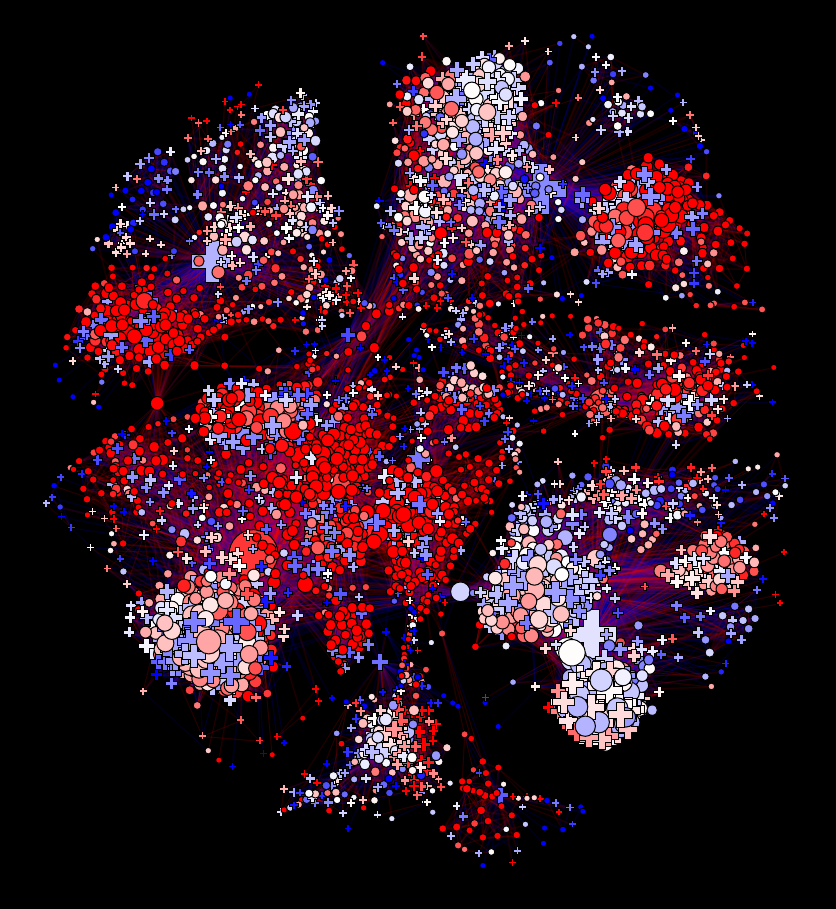
3. Layout Algorithms
A layout algorithm assigns x/y coordinates to nodes. This is a choice, not a technical detail, and different choices reveal different aspects of network structure.

Figure 2. The same network drawn with three different layouts. The bridge nodes (red) are structurally identical in all three, but their visual salience and the legibility of the two communities differ substantially across layouts.
Force-directed (spring) layout
The most commonly used layout for small-to-medium networks. Treats edges as attractive springs and non-edges as repulsive forces, then finds a low-energy configuration. The implicit claim is that proximity ≈ structural cohesion: nodes that are densely connected cluster together, and sparse bridges appear as long edges between clusters.
This claim is often, but not always, correct. The energy landscape typically has multiple local minima, so two runs of the same algorithm on the same network can produce different-looking results. This is a feature (exploring different minima can reveal different structures) and a limitation (results are not reproducible without fixing the random seed). For the Medici network, which you have already analysed, the spring layout will place the Medici node near the centre of the graph, visually reflecting their bridging structural position.
Force-directed layout fails gracefully on small networks and badly on large ones. Above a few hundred nodes, the energy minimisation either fails to converge or converges to a configuration where dense regions form an undifferentiated mass. The OpenFlights network (~3,300 nodes, ~67,000 edges) is far beyond the scale where force-directed layouts produce interpretable results without additional steps.
Circular layout
Positions nodes equally spaced around a circle. No structural information is encoded in node positions; all structure is expressed through the edge pattern. Circular layouts are useful when the edge pattern itself is the object of interest — for example, comparing which nodes are densely cross-connected versus which connect only through specific intermediaries. The Medici network in a circular layout makes the Strozzi–Albizzi cluster legible as a set of interconnected nodes even though the Medici’s bridging position is less visually immediate.
Spectral layout
Uses the eigenvectors of the graph Laplacian to assign coordinates. Specifically, the two eigenvectors corresponding to the smallest non-zero eigenvalues (the Fiedler vector and the next) define an x/y plane that captures the primary directions of variation in the network’s connectivity structure. Nodes that are structurally similar (well-connected to each other) appear close together; nodes that are on opposite sides of the primary cut appear far apart along the x-axis.
Spectral layouts are deterministic (same result every run) and have a direct mathematical interpretation: the layout visualises the algebraic structure of the graph Laplacian. They tend to work best for networks with clear cut structure — two or more communities with relatively sparse connections between them. They perform less well on dense, homogeneous networks where the Laplacian spectrum has no clear gap.
Geographic layout
For networks where nodes have real-world spatial coordinates — airports, power grids, road networks, social networks where users have listed locations — using latitude/longitude as x/y coordinates is often the most informative choice for communication purposes. The geographic layout makes the network immediately interpretable to a non-specialist and connects the analysis to the real world.
For the OpenFlights network, a geographic layout reveals continental clustering (dense edges within North America and Europe), the sparsity of connections across oceans, and the role of geographic bottleneck airports like Anchorage and Reykjavik as bridges between continental clusters. What the geographic layout hides: network-structural proximity. Two airports may be structurally very similar (same degree, same community, many shared neighbours) but geographically distant, and this similarity will be invisible in the geographic layout.
Choosing a layout. The question is not which layout is best, but which structural feature matters for the question you are asking. If your question is “which nodes are the bridges?” the spring layout will show this. If your question is “where in the world are the communities?” the geographic layout is better. If your question is “is there a clear bipartition in this network?” the spectral layout is most appropriate. A circular layout is rarely the best choice for a final figure but can be useful for exploration.
4. Beyond Node-Link Diagrams
The most persistent misconception in network visualisation is that a network must be visualised as a diagram with nodes and edges. This is often wrong — and the cases where it is wrong are precisely the cases where students most need an alternative.

Figure 3. Three representations of the same six-node network. The node-link diagram shows topology; the adjacency matrix (sorted by community) shows block structure; the bar chart shows a single node attribute (degree) precisely. Each answers a different question.
Adjacency matrix
Represent the network as a square matrix where rows and columns correspond to nodes and filled cells indicate edges. If nodes are sorted by community membership, within-community edges form dense blocks along the diagonal and between-community edges appear as scattered off-diagonal entries. This representation:
- Scales to larger networks than node-link diagrams (a 100×100 matrix is perfectly readable; a 100-node force-directed plot often is not)
- Makes community structure visually obvious when nodes are sorted correctly
- Is completely lossless — every edge and non-edge is shown — unlike backbone subgraphs
The adjacency matrix is particularly effective for demonstrating the results of community detection (Tutorial 4). A sorted adjacency matrix with the block-diagonal structure clearly visible is one of the strongest ways to communicate a community detection result.
Geographical map
For spatially embedded networks, plot nodes at their real-world coordinates with edges as lines or arcs. This is not a layout algorithm choice — it is a representation choice. The difference is that a geographic layout uses position to encode real-world geography, not network structure. As discussed in Section 3, this is often the best choice for communicating network findings to non-specialists.
Non-network charts
Perhaps the most underused option: simply do not draw the network at all. Many network findings are most clearly communicated through ordinary statistical charts:
- Bar chart of centrality scores for the top-K nodes: immediately readable by any audience, accurate, and free of hairball problems.
- Scatter plot of two centrality measures against each other (e.g., betweenness rank vs. degree rank): makes the disagreement between measures visible as labelled outliers, which is often the key finding (see Tutorial 3, Exercise 4).
- Ranked table of nodes by some criterion: sometimes the most honest representation is simply “here are the top airports by betweenness centrality” as a labelled list, without any visual.
- Heatmap of community connectivity: replace the full network with a K×K matrix where entry (i, j) is the number of edges between communities i and j. This gives an immediate summary of meso-scale structure.
The question to ask is not “how do I draw this network?” but “what representation most clearly conveys the finding?” The answer is often not a network visualisation at all.
5. Practical Cautions
5.1 Scale changes everything
The techniques that work well for a 30-node network often fail completely at 3,000 nodes. The three most common failure modes at scale:
- Edge overplotting: when thousands of edges overlap, the plot shows only that there are many edges, not where they go. The solution is not a better layout algorithm — it is reducing the number of edges shown (backbone filtering, edge transparency) or abandoning the node-link diagram.
- Node occlusion: nodes overlap and become unreadable. Solutions: reduce node size (which reduces label legibility), filter to a subgraph, or switch to a matrix or geographic representation.
- Layout failure: force-directed algorithms converge to uninformative configurations on large dense networks. The “hairball” — a uniform ball of edges with no visible structure — is a sign that the algorithm has found a local energy minimum that does not reflect the actual network structure.
Recognising these failure modes, and knowing which alternative representation addresses each one, is one of the most practically useful skills in network analysis.
5.2 Colour palettes
- Use qualitative palettes (e.g., ColorBrewer Set1, Set2, Tab10) for categorical variables like community membership. These are designed so that no colour appears more important than any other.
- Use sequential palettes (e.g., Blues, Viridis) for ordered quantities like centrality scores.
- Use diverging palettes (e.g., RdBu, coolwarm) only for quantities with a meaningful midpoint, such as differences from a null model expectation.
- Always check your figures for colour-blind accessibility. Roughly 8% of men have red-green colour blindness; palettes like Okabe-Ito or Viridis are designed to remain distinguishable under all common forms of colour vision deficiency.
5.3 Captions as claims
A figure caption should describe what the figure says, not what it shows. Compare:
- “Node-link diagram of the OpenFlights airport network, with nodes sized by betweenness centrality and coloured by SBM community.” — describes the encoding, makes no claim.
- “High-betweenness airports (large nodes) predominantly sit at community boundaries rather than within communities, suggesting that network bridges rather than intra-community hubs drive long-range connectivity.” — makes a claim, tells the reader what to conclude.
The second form is what the rubric means by “unambiguous captions that clearly describe the narrative of the report.” Every figure in your project report should have a caption of the second type.
5.4 The representation is an argument
Every design choice in a visualisation — the layout algorithm, the channels used, what is included and excluded, whether to draw a network at all — encodes an implicit argument about what matters. Choosing a geographic layout argues that geography is the primary organising principle of the network. Choosing to show only the top 100 nodes by degree argues that the rest are not important for the finding being communicated. These arguments can be right or wrong, and they should be made consciously and defensible.
This is why the exercises in Tutorial 5 ask you to describe and justify your design choices, not just implement them. The reasoning is the result.